


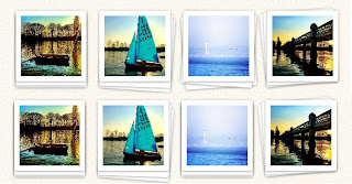
Album gambar dengan efek bertumpuk
Snapshot
Demo Cara pemasangan Pada New Blogger Dashboard---> Klik Drop Down Menu Untuk Blog Anda --->Pilih Template --> Bawah screenshot blog---> pilih "Edit Html" -->Kemudian pilih proceed. Tekan Ctrl + F,cari kod ]]></b:skin> dan letakkan kod dibawah sebelum kod ]]></b:skin>

Demo Cara pemasangan Pada New Blogger Dashboard---> Klik Drop Down Menu Untuk Blog Anda --->Pilih Template --> Bawah screenshot blog---> pilih "Edit Html" -->Kemudian pilih proceed. Tekan Ctrl + F,cari kod ]]></b:skin> dan letakkan kod dibawah sebelum kod ]]></b:skin>
.group {
margin:20px;
}
/*
Stacks CSS ----------------------------------------------------------------------------------------------------------- */
/* Layout */
.stack { float: left; width: 22%; margin: 0 4% 4% 0; position: relative; z-index: 10; }
/* Image styles */
.stack img { max-width: 100%; height: auto; vertical-align: bottom; border: 10px solid #fff; border-radius: 3px;
-webkit-box-sizing: border-box;
-moz-box-sizing: border-box;
box-sizing: border-box;
-webkit-box-shadow: 0 1px 4px rgba(0, 0, 0, 0.4);
-moz-box-shadow: 0 1px 4px rgba(0, 0, 0, 0.4);
box-shadow: 0 1px 4px rgba(0, 0, 0, 0.4);
}
.stack:last-of-type { margin-right: 0; }
/* Stacks creted by the use of generated content */
.stack:before, .stack:after { content: ""; border-radius: 3px; width: 100%; height: 100%; position: absolute; border: 10px solid #fff; left: 0;
-webkit-box-sizing: border-box;
-moz-box-sizing: border-box;
box-sizing: border-box;
-webkit-box-shadow: 0 1px 4px rgba(0, 0, 0, 0.4);
-moz-box-shadow: 0 1px 4px rgba(0, 0, 0, 0.4);
box-shadow: 0 1px 4px rgba(0, 0, 0, 0.4);
-webkit-transition: 0.3s all ease-out;
-moz-transition: 0.3s all ease-out;
transition: 0.3s all ease-out;
}
.stack:before { top: 4px; z-index: -10; } /* 1st element in stack (behind image) */
.stack:after { top: 8px; z-index: -20; } /* 2nd element in stack (behind image) */
/* Second stack example (rotated to the right from the bottom left) */
.stack.rotated:before {
-webkit-transform-origin: bottom left;
-moz-transform-origin: bottom left;
transform-origin: bottom left;
-webkit-transform: rotate(2deg);
-moz-transform: rotate(2deg);
transform: rotate(2deg);
}
.stack.rotated:after {
-webkit-transform-origin: bottom left;
-moz-transform-origin: bottom left;
transform-origin: bottom left;
-webkit-transform: rotate(4deg);
-moz-transform: rotate(4deg);
transform: rotate(4deg);
}
/* Third stack example (One stack element rotated in the opposite direction) */
.stack.twisted:before {
-webkit-transform: rotate(4deg);
-moz-transform: rotate(4deg);
transform: rotate(4deg);
}
.stack.twisted:after {
-webkit-transform: rotate(-4deg);
-moz-transform: rotate(-4deg);
transform: rotate(-4deg);
}
/* Fourth stack example (Similar to the second but rotated left) */
.stack.rotated-left:before {
-webkit-transform-origin: bottom left;
-moz-transform-origin: bottom left;
transform-origin: bottom left;
-webkit-transform: rotate(-3deg);
-moz-transform: rotate(-3deg);
transform: rotate(-3deg);
}
.stack.rotated-left:after {
-webkit-transform-origin: bottom left;
-moz-transform-origin: bottom left;
transform-origin: bottom left;
-webkit-transform: rotate(-6deg);
-moz-transform: rotate(-6deg);
transform: rotate(-6deg);
}
/* Reset all rotations on hover */
.stack:hover:before, .stack:hover:after {
-webkit-transform: rotate(0deg);
-moz-transform: rotate(0deg);
transform: rotate(0deg);
}
/*
iPhone and mobile widths --------------------------------------------------------------------------------------------------------------------------- */
@media only screen and (min-width: 320px) and (max-width: 480px) {
.stack { float: none; width: auto; margin-bottom: 35px; }
h1.title { margin: 15px 0; }
}
Pergi ke Design-->Page Element-->Add Gadget HML/Javascript,pastekan kod ni didalamnya
<div class="group">
<div class="stack">
<img src="http://picbox.im/image/40382b2ed0-image1.jpg" alt="" />
</div>
<div class="stack rotated">
<img src="http://picbox.im/image/e978a34cdd-image2.jpg" alt="" />
</div>
<div class="stack twisted">
<img src="http://picbox.im/image/701845e85d-image3.jpg" alt="" />
</div>
<div class="stack rotated-left">
<img src="http://picbox.im/image/fb2d3edc2b-image4.jpg" alt="" />
</div>
</div>
Ubah link gambar dalam baris hijau kepada link gambar korang suka

Post a Comment:
Nota: Hanya ahli blog ini sahaja yang boleh mencatat ulasan.